Homage to the Square: Fine Art Prints Inspired by Josef Albers' Bauhaus Color Studies
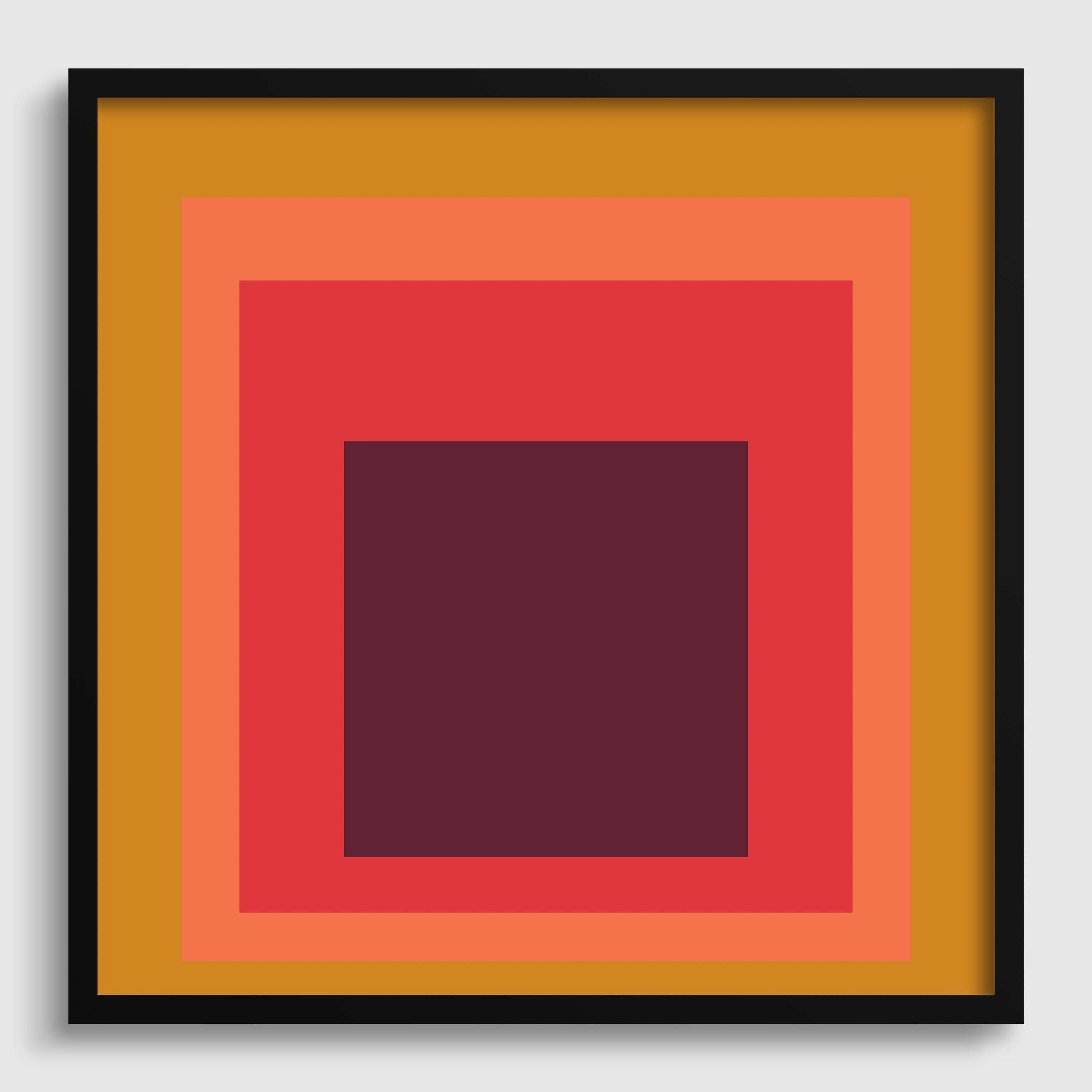
Josef Albers spent twenty-five years painting the same composition. Nested squares. Color on color. No texture, no gesture, no narrative — just the way one color changes the appearance of another depending on what surrounds it.
Homage to the Square became one of the most studied bodies of work in twentieth-century art not because of its form, which is deliberately simple, but because of what it demonstrates: that color is never fixed. The same red looks warmer against grey and cooler against orange. The eye is not a reliable instrument. Albers spent a career proving it.
That systematic rigor is why his work continues to resonate with architects, interior designers, and serious collectors — and why the aesthetic has outlasted most of his contemporaries.

Original Prints vs. Inspired Works: Understanding the Market
Before buying anything described as an "Albers print," it's worth understanding what you're actually looking at, because the market spans several very different tiers.
Original authenticated prints — screenprints Albers produced and approved during his lifetime — are handled by a small number of authorized galleries and auction houses. Cristea Roberts Gallery in London is the Josef & Anni Albers Foundation's official representative for print sales. Works at this level carry provenance documentation and sell for thousands to tens of thousands of dollars. They are investment-grade objects.
Inspired works are a different category entirely. These are original compositions by independent artists working in the tradition of Albers' color interaction studies — nested geometric forms, Bauhaus palette relationships, systematic color exploration — produced as fine art prints on archival materials. They are not reproductions of his paintings, and they make no claim to be. They are new works that engage with his ideas.
At 9 Art Prints, our Albers-inspired collection falls into this second category. Each piece is an original color study produced in the spirit of Homage to the Square — exploring the same tension between colors that Albers spent his career examining.
Why the Albers Aesthetic Endures in Interiors
There is a reason interior designers return to this visual language consistently. Nested squares at scale function differently from most wall art — they don't compete with a room, they interact with it. The colors shift depending on the light, the time of day, and what sits alongside them. A piece that reads as warm amber in afternoon sun reads differently under artificial light at night.
This is precisely what Albers was studying. The work was never meant to be static. It was meant to demonstrate that the eye is always in negotiation with its surroundings.
For spaces where the art needs to hold up over time — rather than trend in and out — geometric color studies have a longevity that figurative or decorative work often doesn't.

What Archival Quality Means for Color-Sensitive Work
Color accuracy matters more for work in this tradition than for almost any other subject matter. A landscape tolerates some color drift. A Bauhaus color study — where the entire point is the precise relationship between two or three specific tones — does not.
Every print in our collection is produced on Hahnemühle German Etching 310gsm using archival pigment inks. Hahnemühle German Etching is a cotton-based, acid-free paper used by fine art studios and museum print departments worldwide. At 310gsm, it provides the structural weight and surface texture that color-saturated geometric work requires.
Pigment-based inks — as opposed to standard dye-based inks — are what make the color relationships in this work stable over time. Dye-based inks fade unevenly, which is particularly damaging for work where the balance between two colors is the subject of the piece. Archival pigment inks are rated for 100+ years without significant color shift under normal display conditions.
What to Look For

If you're buying any fine art print in this tradition — from us or elsewhere — the questions worth asking:
Is it giclée printed? Giclée is the process standard for archival fine art reproduction and original print production. It uses pigment inks and high-resolution inkjet technology capable of rendering the subtle gradients and flat color fields that geometric work demands.
What is the paper? Cotton rag, Hahnemühle, or equivalent archival stock at 300gsm or above. Glossy or standard coated paper is not appropriate for work intended as a permanent installation.
Is it an original composition or a reproduction? Know which you're buying. Original inspired works and licensed reproductions of specific Albers paintings are different things with different legal and aesthetic implications.
The Collection
Our Josef Albers-inspired collection is printed on Hahnemühle German Etching 310gsm with archival pigment inks. Each piece is an original color study made to be kept.
