What Paper Is Best for Art Prints? Matte, Rag, Textured, and Poster Paper Compared
This article is part of our Guide to Buying Fine Art Prints.
When people buy art prints online, they usually focus on the image first.
That makes sense. But the paper changes more than most buyers realize.
It changes how the print feels in person. It changes how much depth it has. It changes whether the piece reads as a casual poster, a clean graphic print, or a more serious fine art object.
So what paper is best for art prints?
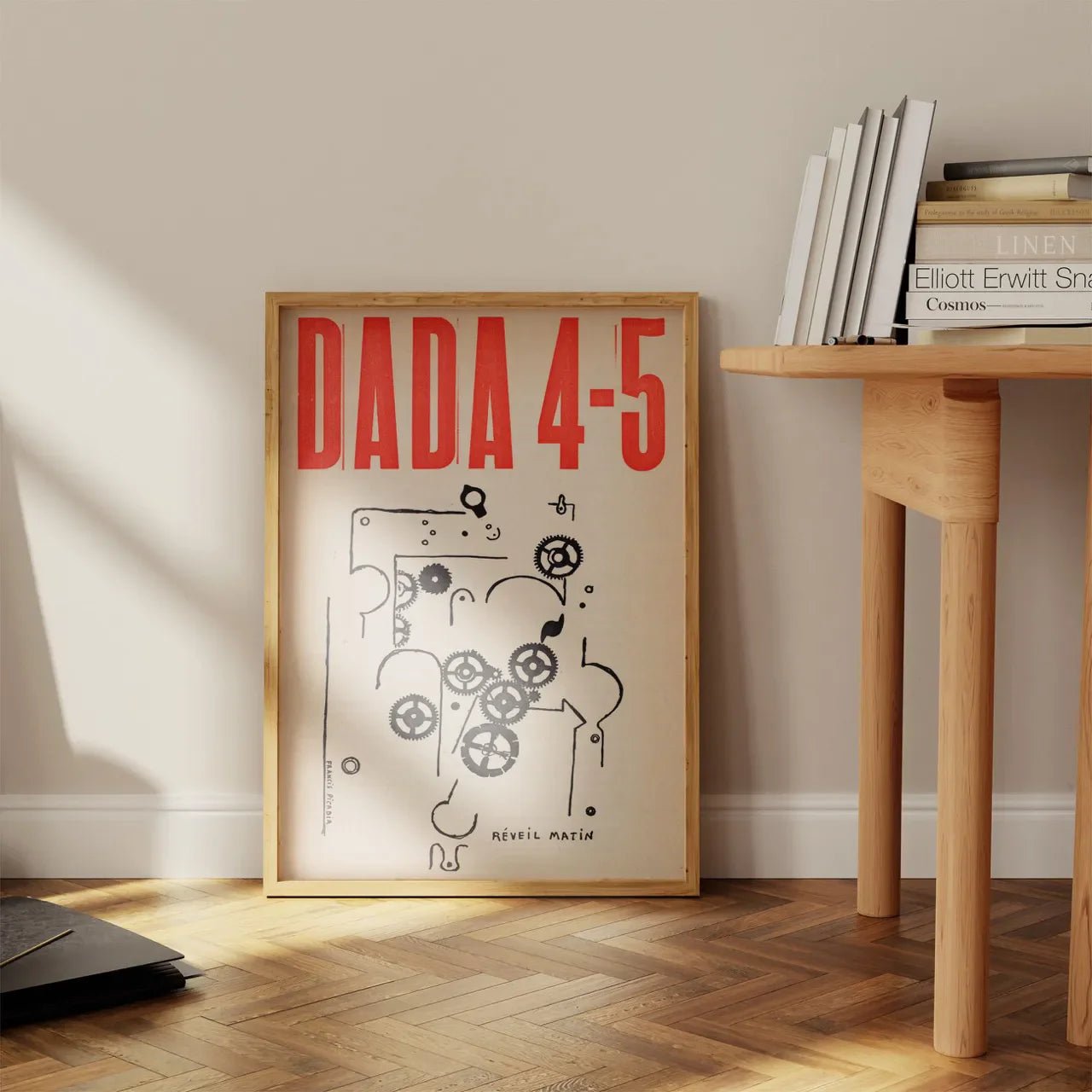
In brief: The best paper for art prints depends on the artwork. Textured fine art paper is often best for painterly reproductions, richly detailed historical works, and atmospheric images. Rag paper suits premium prints with a softer refined finish. Smooth matte paper works well for posters, typography, maps, Bauhaus graphics, and cleaner modern images. Poster paper is suitable for casual décor, but usually does not have the same physical presence as a fine art sheet.
Quick Answer: Match the Paper to the Artwork
The best paper depends on the kind of image you are printing. Here is the simplest way to think about it:
| Paper type | Best for | Why it works |
|---|---|---|
| Textured fine art paper | Paintings, watercolours, drawings, atmospheric works, historical reproductions | Adds surface character, depth, and a more serious fine art feel. |
| Rag paper | Premium fine art prints, soft tonal images, refined matte reproductions | Feels substantial and archival without always looking heavily textured. |
| Smooth matte paper | Graphic art, posters, typography, maps, diagrams, clean modern images | Keeps edges clean and avoids adding texture where the image does not need it. |
| Poster paper | Casual décor, budget-friendly prints, short-term wall art, flat graphic images | Works when the goal is affordability and a clean visual result, not fine art presence. |
| Photography paper | Photographs, especially crisp, detailed, or high-contrast images | The right choice depends on whether the photograph needs sharpness, softness, gloss, or texture. |
So the real answer is not simply “matte” or “archival.” The real answer is: choose the paper that suits the artwork.
A painterly reproduction usually benefits from a heavier fine art paper. A text-heavy poster may not. A Bauhaus print may need clarity more than texture. A richly detailed Orientalist painting may need a paper with more surface character and depth. A photograph depends on the image.
Examples: Which Artworks Suit Which Paper?

Pictured - Offset Magazine Cover | Joost Schmidt
One practical way to understand paper is to look at the artwork itself.
Clean, graphic images often suit the smooth-paper side of the decision: posters, typography, Bauhaus geometry, maps, and strong flat colour. Good examples include Joost Schmidt’s Bauhaus poster, Bauhaus Ausstellung 1923, Piet Mondrian’s Composition (1936), and Leonetto Cappiello’s Florio Cinzano poster.

Pictured - The Musician | Rudolf Ernst
Painterly, figurative, historical, or richly detailed images usually make a stronger case for textured fine art paper. Examples include Rudolf Ernst’s The Musician, Ludwig Deutsch’s The Inspection, Alphonse Mucha’s Médée, and Kawase Hasui’s Hikawa Park.
That does not mean one paper is always “better.” It means the surface should serve the image.
First, One Important Clarification: “Matte” Is Not a Complete Answer
A lot of print shops describe their paper simply as “matte,” as though that settles the question.
The real picture is more nuanced.
“Matte” only tells you the surface is non-glossy. It does not tell you whether the paper is a thin poster stock, a smooth fine art paper, a cotton rag, or a heavily textured premium sheet.
So while the word is useful, it is only one part of the story.
This is why serious print sellers usually tell you more: the actual paper name, the weight, and whether it is smooth, textured, rag-based, or something else.
1. Textured Fine Art Paper
If you are printing a fine art reproduction, textured fine art paper is often one of the best choices.
This is especially true for artwork that was originally made with visible surface character — oil paintings, acrylic paintings, watercolours, ink works, charcoal drawings, Orientalist paintings, historical scenes, or illustrations that benefit from a more tactile, dimensional presentation.
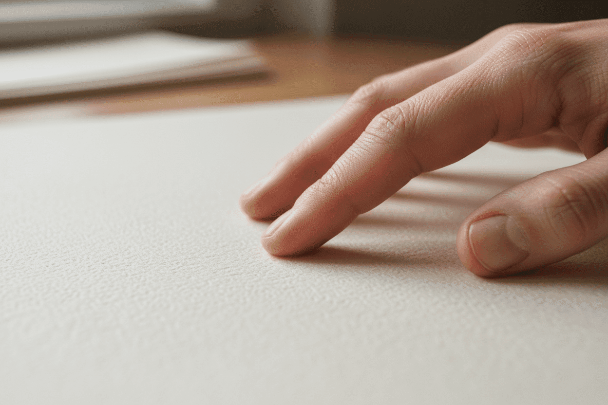
Textured fine art paper helps the print feel less flat. It adds surface character, richness, and physical presence. In many cases, that makes the finished print feel much closer to a serious art object than a decorative wall print.
On our site, this is the kind of paper logic that especially suits richly detailed or atmospheric works such as Rudolf Ernst’s The Musician, Ludwig Deutsch’s The Inspection, Josep Tapiró i Baró’s Orientalist statement duo, and Alphonse Mucha’s Médée. These are not flat graphic images; they depend on atmosphere, figure, ornament, line, and tonal depth.

Pictured - Medee | Alphonse Mucha
At 9 Art Prints, this is one reason we use Hahnemühle German Etching 310 gsm for many of our core fine art reproductions. It is a heavyweight fine art paper with a distinct textured surface, and that texture gives many artworks more depth and authority in person.
If the original artwork had visible brushwork, softness, tactility, or painterly depth, textured fine art paper is often where the conversation gets more interesting.
2. Rag Paper
Rag paper is another premium option, but it is not exactly the same thing as textured fine art paper.
Most buyers use “rag paper” to mean a high-end cotton fine art paper, often with archival qualities and a softer, more refined feel than ordinary print stock.
Some rag papers have noticeable texture. Others are much smoother.
That is why rag paper is best thought of as a premium fine art category, not as a single visual finish.
Smooth rag papers can be an excellent choice when you want the print to feel serious and archival, but you do not necessarily want a pronounced etched or tactile texture. They often work beautifully for fine art prints that benefit from softness, tonal subtlety, and a refined matte finish.
If textured fine art paper gives a print more visible surface character, smooth rag paper often gives you a more understated premium result.
Rag paper can be especially useful for photography, softer tonal images, refined modern reproductions, and works where the surface should feel premium but not visibly rough.
3. Smooth Matte Paper
Smooth matte paper can make a lot of sense — depending on the artwork.
If the original image is very flat, graphic, clean-edged, or text-heavy, then a smooth surface is often the better fit. Posters, typography, graphic design prints, maps, diagrams, Bauhaus studies, Josef Albers-inspired geometric prints, and some digitally created works often do not need the tactile richness of a textured fine art sheet.
In those cases, smooth matte paper can look cleaner, sharper, and more natural.
This is why cleaner graphic works, such as Joost Schmidt’s Bauhaus poster, Bauhaus Ausstellung 1923, Piet Mondrian’s Composition (1936), and Bauhaus Ausstellung Waves, are useful examples. The image depends on clarity, geometry, colour blocks, and edge definition more than visible paper texture.

Pictured - Bauhaus Ausstellung Waves
This is also where buyers should be careful not to overgeneralize. Smooth matte paper can refer to anything from a simple standard print stock to a premium smooth fine art paper. The label only becomes useful when the seller tells you exactly what paper they mean.
A smooth paper is not automatically cheap. A textured paper is not automatically better. The question is whether the paper helps the artwork do what it needs to do.
4. Poster Paper
Poster paper has its place.
It is usually the more practical choice for casual décor, budget-friendly prints, text-led designs, and situations where the goal is a clean visual result rather than a premium fine art object.
It is also often perfectly suitable for classic posters, graphic prints, and other flatter images where the artwork itself is not relying on tactile depth or material richness.
Classic poster-style works make the point clearly. A design like Metropolis (1927), Florio Cinzano, or Steinlen’s Chat Noir is built around graphic impact. The paper still matters, but the image itself does not need the same kind of tactile surface as a painterly historical reproduction.

Pictured - Metropolis Movie Poster
Where poster paper is usually less convincing is when you want the finished print to feel substantial, textured, or archival in a fine art sense. If the goal is a more elevated object, many buyers will prefer a heavier fine art paper instead.
That does not make poster paper bad. It simply means it is serving a different purpose.
What About Photography?

Pictured - Tellesplatte, Switzerland | Daniela Faust
Photography is where the answer becomes more image-specific.
Some photographic prints look beautiful on rag or textured fine art papers. Others look better on smoother papers that preserve a cleaner, sharper photographic feel.
If the image is soft, atmospheric, or painterly, a rag or textured fine art paper can work very well. If the image is crisp, modern, architectural, highly detailed, or dependent on very clean edges, a smoother photographic or fine art paper may make more sense.
So for photography, rag or textured paper is not automatically the winner. The better question is what kind of surface best serves that particular image.
For black-and-white architectural photography, the key is often tonal range, surface control, and clarity. For softer photographic work, a more tactile matte paper may be more appropriate.
Browse our Photography collection for examples of photographic works where the right paper should support tone, light, and composition rather than simply adding texture.
So What Paper Is Actually Best?
Here is the simplest version:
- For fine art reproductions of paintings, watercolours, drawings, Orientalist works, and other tactile or painterly originals: textured fine art paper is often the strongest choice.
- For a premium fine art print with a softer, smoother finish: rag paper is an excellent option.
- For posters, Bauhaus prints, graphic work, text-heavy pieces, maps, and flatter source images: smooth standard or smooth matte paper is often completely appropriate.
- For classic poster-style designs: the paper should support graphic impact, clean colour, and sharp design rather than trying to imitate painterly texture.
- For photography: the right paper depends on the image.
That is the real answer.
Not every artwork needs the same paper. And not every print needs a high-end textured fine art sheet.
But if the goal is a serious fine art reproduction, especially one with visual depth and material presence, heavier fine art papers are usually where the difference begins.
What to Look for From a Seller
More important than marketing language is whether the seller tells you what the paper actually is.
Look for things like:
- the exact paper name
- the weight in gsm
- whether the paper is textured or smooth
- whether it is a cotton rag paper or another fine art stock
- whether the print process matches the type of artwork
This matters because terms like “premium matte,” “museum-quality,” or even “archival paper” can still be vague if the seller never names the actual material.
The best print sellers usually specify the paper because once the paper is named, the buyer no longer has to guess.
If you want a broader breakdown of how to evaluate those claims, read How Do I Know If an Art Print Is Actually High Quality?, What Does “Museum-Quality” Actually Mean for Art Prints?, and Does Thicker Paper Make for a Better Art Print?.
Where 9 Art Prints Fits
At 9 Art Prints, we do not think paper should be treated as an afterthought.
For many core fine art reproductions, especially painterly, historical, richly coloured, or atmospheric works, we use Hahnemühle German Etching 310 gsm because the surface and weight help the print feel substantial in person.
For graphic works, vintage posters, Bauhaus-inspired pieces, and modernist images, the goal is slightly different: paper should support clarity, colour, line, and design. That is why the best paper choice depends on the image, not on a single universal rule.
You can browse related collections here:
- Orientalist Art for richly detailed painterly works where textured paper matters.
- Bauhaus and Avant-Garde Modernism for graphic modernist prints where clarity and colour relationships matter.
- Josef Albers-inspired prints for clean geometric color studies.
- Vintage Maps and Posters for travel, film, advertising, and period graphic design prints.
- Photography for fine art photographic prints.
The Bottom Line
The best paper for art prints depends on the artwork.
For painterly, tactile, or fine art reproductions, textured and rag-based fine art papers are often the best choices. For posters, flatter graphics, Bauhaus designs, maps, typography, and text-heavy work, smooth standard or smooth matte paper can be completely appropriate. And for photography, the answer depends on the image.
What matters most is not just whether the seller says “matte” or “archival.” It is whether they tell you exactly what paper you are buying.
That is usually where the difference between a vague print listing and a serious fine art print starts to show.
Further Reading
- The Ultimate Guide to Fine Art Prints
- Does Thicker Paper Make for a Better Art Print?
- How Do I Know If an Art Print Is Actually High Quality?
- What Does “Museum-Quality” Actually Mean for Art Prints?
- Fine Art Prints vs Posters: Why the Paper Changes Everything
- Giclée vs Digital Print: What’s the Real Difference?
- What Does Archival Mean in Art Prints?