


How Do I Pair Two or Three Art Prints Together?
This article is part of our Ultimate Fine Art Print Buyer's Guide.

Two or three prints hung together can look like one deliberate piece of design — or like three things that happened to be on sale at the same time. The difference is rarely the art itself. It is whether the pictures share something the eye can pick up straight away.
In brief: Make sure your prints share at least one thing — the same artist, the same palette, the same subject or the same format and frame. One shared thread is enough; two makes it effortless. Then hang them at the same size, with even gaps, and treat the group as a single piece when you measure the wall.
Rule 1: Same artist

The safest pairing of all. One artist brings one hand, one way of using colour and one sense of scale, so the prints agree with each other before you have done anything. Kawase Hasui is ideal: the Hasui Snow Trio puts a snow-covered pagoda, a view of Mount Fuji through snow-laden branches and a red temple gate with a figure under an umbrella side by side — three different places, one winter. The Hasui Autumn Trio does the same in reds and golds: birches by a lake, a red maple against a blue mountain, and a temple path under orange leaves.
You can also build your own pair from a single artist. Our seven-print Rain, Moonlight & Silence collection is designed for exactly that. Rain at Teradomari — a figure in a yellow straw raincoat walking a wet village street at night, lit windows reflected in the puddles — sits beautifully beside Moon over Magome, a great dark pine against a deep blue sky with a full moon and one small lit house. Same blues, same night, two different moods.
Rule 2: Same palette
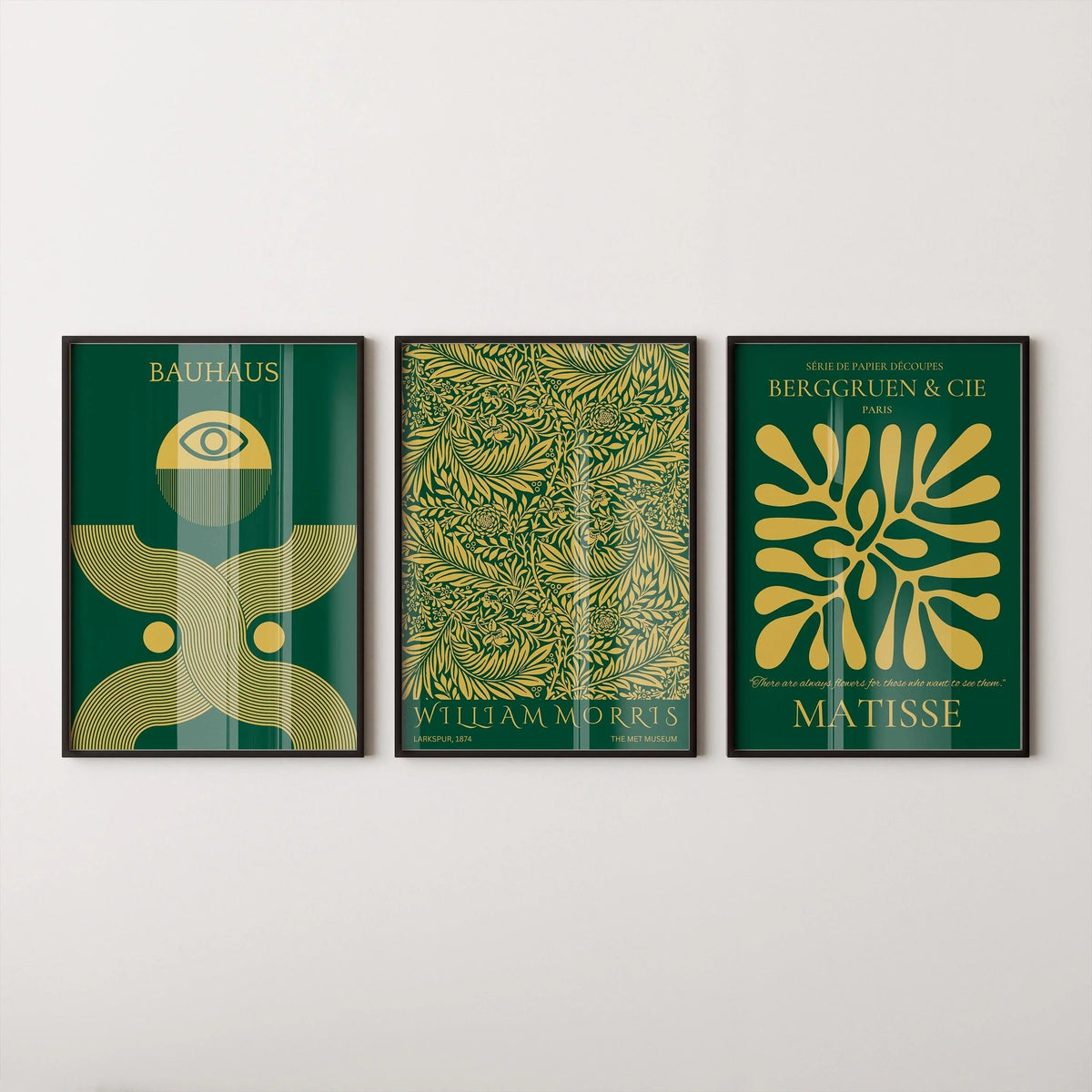
This is the rule that lets you mix artists, centuries and styles. If the colours match closely, almost anything can hang together. The Bauhaus, Morris & Matisse Emerald Green & Gold Trio at the top of this article is the proof: a Bauhaus-style poster with an eye and arch motif, a dense William Morris leaf pattern and a Matisse cut-out from his Berggruen exhibition poster. Three completely different worlds — a German art school, a Victorian designer and a French painter — but all in deep emerald and gold, so they read as one.
When you choose your own, pick one dominant colour and one accent, and check that each print carries both. A blue-and-ochre print next to a green-and-red one will fight; two blue-and-ochre prints will settle.
Rule 3: Same subject

Birds, boats, mountains, flowers: a shared subject gives a group a story. The Audubon Statement Trio is a good model — two Arctic terns diving against pale blue on the outside, a white Arctic hawk in the middle. The outer prints mirror each other, which makes the centre one feel like the hero. That symmetry is the simplest trick for any trio: two matching ends, one different middle.
A subject can also be a single image split in two. The Emerald Moth & Butterfly Statement Duo divides one golden butterfly down the middle across two deep-green panels, so the pair only makes sense together — perfect for either side of a doorway or over a pair of bedside tables.
Rule 4: Same format and frame

When the pictures themselves share a structure, you can change everything else. Josef Albers spent decades painting the same composition — squares nested inside squares — in different colours, which makes his work the clearest example there is. The After Albers Temple & Oasis Duo pairs one square in dark green, plum and lilac with another in ochre, teal and navy: no colours in common, but the same shape, so they look made for each other. Browse the rest of the Albers-inspired collection to build your own pair.

Pattern prints work the same way. The William Morris Wild Tulip & Marigold Duo sets two Morris designs in an identical poster layout — the Marigold in blue on pale paper, the Wild Tulip in pale on coral — so the lettering and margins hold them together while the colours do the talking. Our Patterns collection is full of designs that pair like this.
Whatever you choose, the frames should match. Same colour, same profile, same size. Our frames come in black, white, natural oak and brown walnut: black sharpens a group, white and natural oak keep it light, brown walnut warms it up.
How to hang a pair or a trio
Treat the group as one picture. Measure the furniture below and aim for the whole group — prints plus gaps — to span roughly 60 to 75 per cent of its width. The Fine Art Print Size Guide has the numbers for each wall.
Keep the gaps even and tight. Around 5 to 8 cm between frames keeps a pair reading as a unit. Wider gaps turn it back into separate pictures.
Line up the centres. Hang the middle of the group at roughly eye level, about 145 to 150 cm from the floor, or 20 to 25 cm above a sofa or sideboard.
Don't go too small. Buying prints that are too small for the wall is one of the most common art-buying regrets, and grouping small prints does not fully fix it. The 3 Biggest Art Print Buying Regrets explains why it is usually better to size up.
For larger arrangements — four, six or nine pieces — our earlier piece The Art of Art Sets covers gallery-wall layouts.
Every print is made on Hahnemühle fine art paper with archival pigment inks, so prints bought together — or months apart — match in surface and tone.
Summary: Give your prints one thing in common — artist, palette, subject or format. Match the frames. Keep the gaps even. Size the whole group to the furniture, not each print on its own. Or skip the guesswork and start with a set that has already been matched for you.


