Textured Fine Art Paper vs Smooth Matte Paper: Which Should You Choose?
This article is part of our Guide to Buying Fine Art Prints.

Paper choice changes the way an art print feels in person.
But the choice is not always obvious.
Some prints look better on textured fine art paper. Others look cleaner and stronger on smooth matte paper. A richly detailed painting reproduction may benefit from surface texture and weight. A Bauhaus poster may look better when the paper does not interfere with the edges, type, and colour blocks.
So which should you choose?
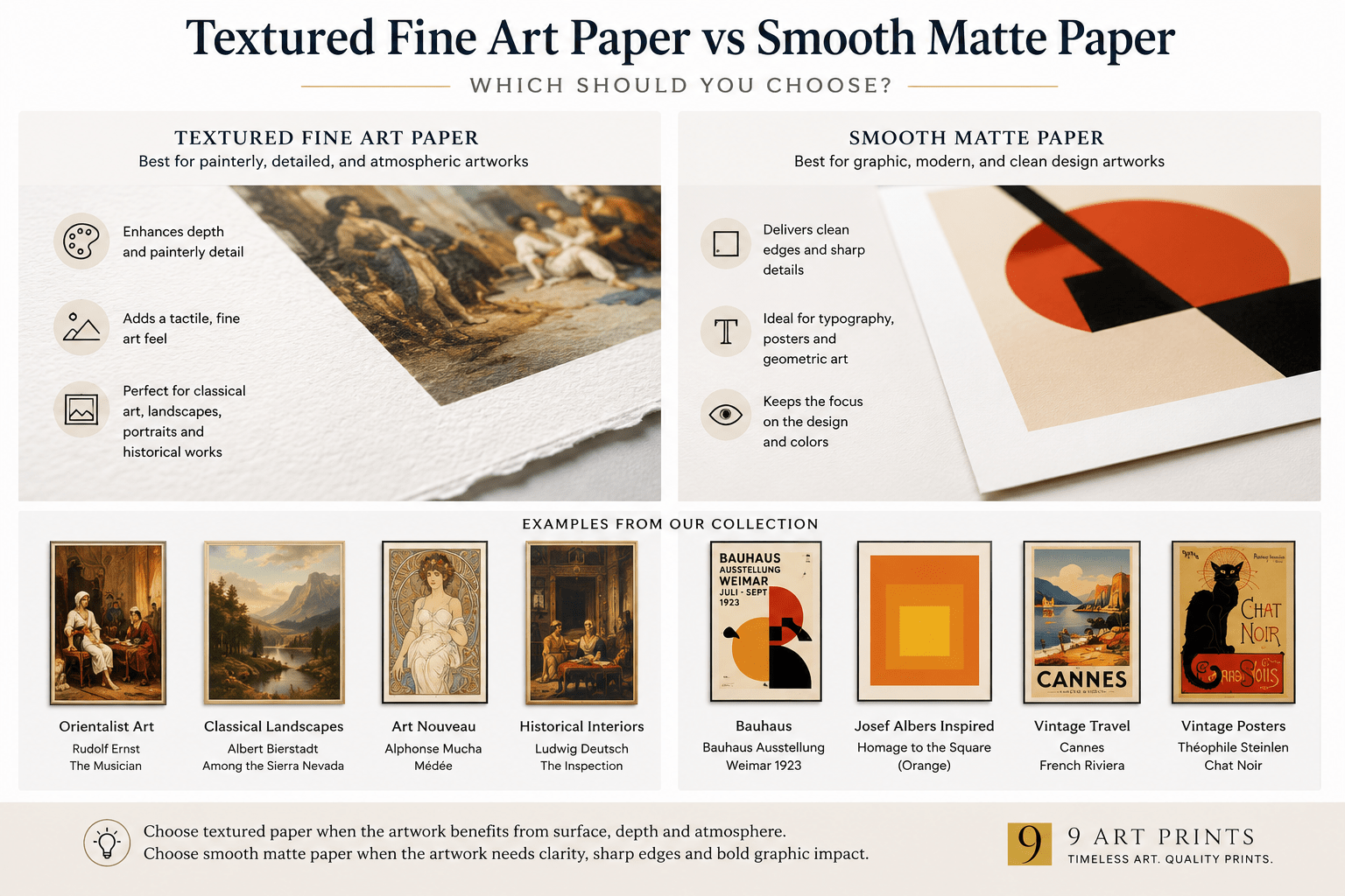
In brief: Textured fine art paper is usually best for painterly, detailed, atmospheric, historical, or tactile artworks. Smooth matte paper is usually better for graphic art, typography, Bauhaus prints, maps, posters, clean photography, and modern images where sharp edges matter. Neither is automatically better. The right paper is the one that serves the artwork.
Quick Answer: Textured vs Smooth Matte Paper
| Choose textured fine art paper for... | Choose smooth matte paper for... |
|---|---|
| Paintings and painterly reproductions | Posters and graphic design prints |
| Orientalist, classical, historical, or figurative art | Bauhaus, modernist, and geometric prints |
| Watercolours, drawings, and works with visible surface character | Typography, maps, diagrams, and clean linework |
| Atmospheric images with shadow, depth, and tonal variation | Flat colour, sharp edges, and poster-style compositions |
| Prints where the paper should feel like part of the artwork | Prints where the paper should stay visually quiet |
The simplest rule is this:
If the artwork depends on texture, depth, atmosphere, or painterly detail, textured fine art paper usually helps. If the artwork depends on clean edges, typography, geometry, or flat colour, smooth matte paper may be the better fit.
What Is Textured Fine Art Paper?
Textured fine art paper is a premium paper with visible or tactile surface character.
It may have a felt-like, etched, watercolour, mould-made, or softly grainy surface. The texture is not usually rough in a crude way. In good fine art papers, it is controlled and intentional.
That surface can help a print feel more substantial. It can add depth to painterly images, soften digital flatness, and make the finished object feel closer to a fine art reproduction than a simple poster.
This is why textured fine art paper is often used for:
- painting reproductions
- watercolours
- drawings
- historical illustrations
- Orientalist art
- classical and figurative works
- atmospheric landscapes
- images with shadow, fabric, skin tones, architecture, ornament, or tonal depth
At 9 Art Prints, many of our core fine art reproductions are printed on Hahnemühle German Etching 310 gsm, a heavyweight textured fine art paper. It has a defined felt structure and a matte inkjet coating designed for fine art applications.
That kind of paper makes particular sense for works where the image should not feel slick, shiny, or flat.
What Is Smooth Matte Paper?
Smooth matte paper is non-glossy paper with little or no visible surface texture.
It can range from simple matte poster stock to premium smooth fine art paper. The phrase “smooth matte” by itself does not tell you the whole quality level. It tells you the surface is matte and relatively smooth.
A smooth matte surface is useful when the artwork needs clarity rather than texture.
It is often a good fit for:
- posters
- typography
- maps
- Bauhaus prints
- modernist graphics
- Josef Albers-inspired geometric prints
- flat colour compositions
- digital art
- clean architectural photography
- artworks where sharp edges matter
The advantage is restraint. Smooth matte paper does not add much visual noise. It lets the shape, line, colour, and composition speak more directly.
That can be exactly what a graphic print needs.
Why Texture Can Make Some Prints Look Better
Texture can give a print physical presence.
For painterly artwork, that matters.
A reproduction of a painting is not only an image. It is also an attempt to carry some of the feeling of the original medium: brushwork, pigment, surface, softness, depth, and atmosphere.
A textured paper cannot reproduce actual paint texture. But it can prevent the print from feeling too slick or mechanically flat.
This is especially useful for images with:
- fabric and ornament
- skin tones
- architectural details
- heavy shadows
- layered colour
- antique or historical atmosphere
- fine linework
- soft transitions between tones
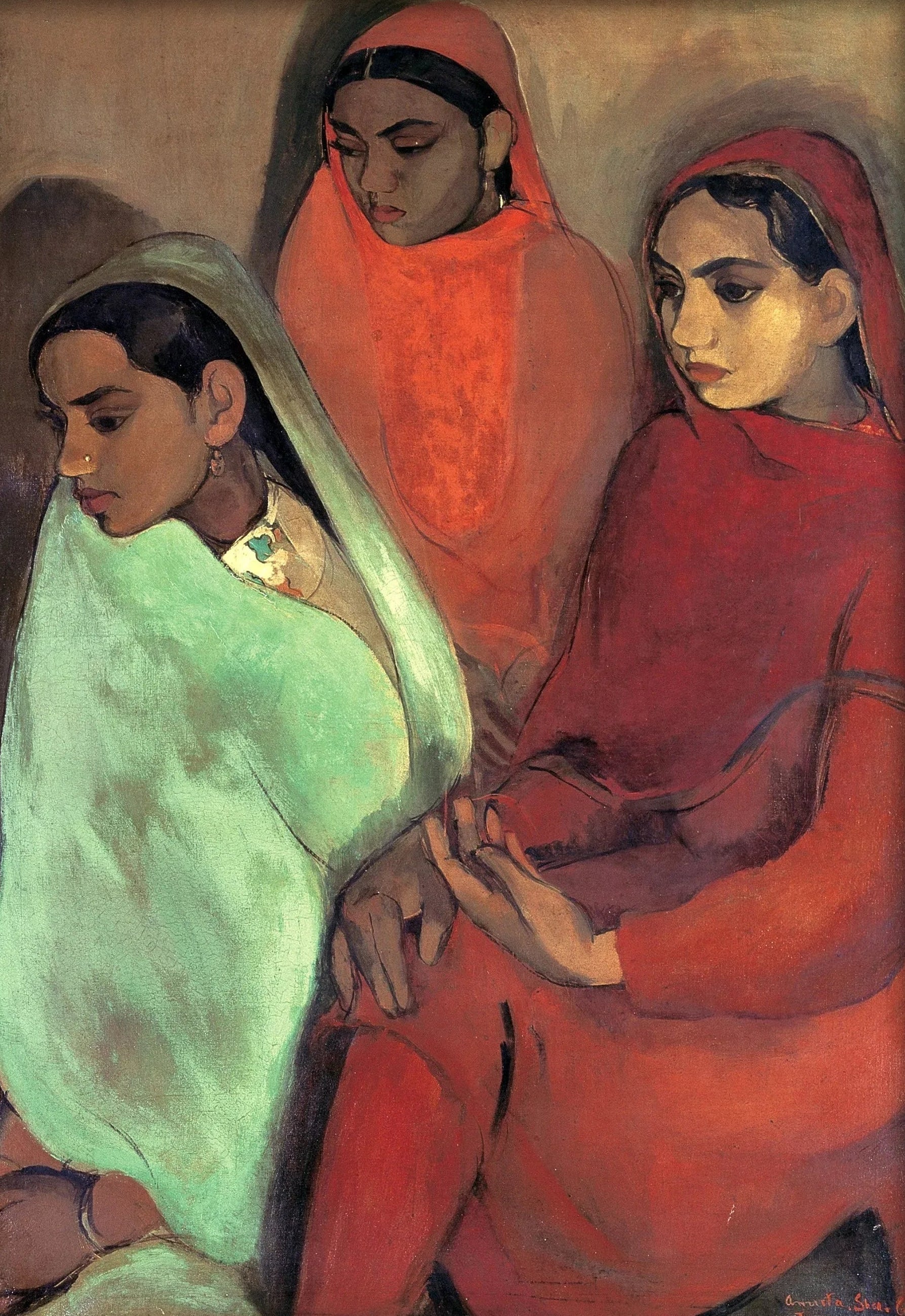
For example, richly detailed Orientalist works such as Rudolf Ernst’s The Musician or Ludwig Deutsch’s The Inspection benefit from paper that can support depth, shadow, detail, and a more tactile presentation.
The same logic can apply to decorative and figurative works such as Alphonse Mucha’s Médée, where line, ornament, figure, and colour all matter.
Browse our Orientalist Art collection for examples of works where textured fine art paper often makes sense.
When Texture Can Get in the Way
Texture is not always an advantage.
Some artworks are designed to feel flat, direct, and graphic. In those cases, too much texture can distract from the image.
A Bauhaus poster, for example, usually depends on geometry, type, shape, and colour relationships. Its power is not painterly softness. Its power is clarity.
The same is true of many modernist, typographic, and geometric works.
For these images, the paper should not compete with the design.
Examples include Joost Schmidt’s Bauhaus poster, Bauhaus Ausstellung 1923, Piet Mondrian’s Composition (1936), and our Josef Albers-inspired prints.
In these cases, a smoother matte surface can feel more natural because it supports the visual logic of the work: clean shape, clean colour, clean edge.
Textured Paper for Paintings, Classical Art, and Historical Works
Textured fine art paper is usually the stronger choice for art that wants to feel tactile, atmospheric, or historically grounded.
This includes many reproductions of:
- oil paintings
- watercolours
- portraits
- landscapes
- interiors
- historical scenes
- Orientalist paintings
- Art Nouveau posters with painterly or decorative detail
The goal is not to make the paper louder than the image. The goal is to give the print enough physical character that it does not feel like an ordinary flat reproduction.
A textured sheet can make the paper feel like part of the presentation.
This is especially valuable when the print will be bought unframed, handled directly, given as a gift, or displayed as a serious piece of wall art.
For more on why paper weight also matters, read Does Thicker Paper Make for a Better Art Print?.
Smooth Matte Paper for Posters, Bauhaus, Maps, and Graphic Art
Smooth matte paper often works better when the artwork is clean, bold, and graphic.
A vintage poster is not trying to imitate oil paint. A Bauhaus exhibition print is not trying to look like a textured drawing. A map may need line clarity more than surface depth.
For works like these, a smoother surface helps preserve:
- typographic sharpness
- edge definition
- flat colour areas
- geometric balance
- poster-like impact
- legibility
Classic poster-style works such as Metropolis Movie Poster, Leonetto Cappiello’s Florio Cinzano, and Steinlen’s Chat Noir are useful examples. These images rely on graphic force more than tactile paper texture.
Browse our Vintage Maps and Posters collection for travel, film, advertising, and period graphic prints where clarity and poster impact matter.
What About Photography?
Photography can go either way.
Some photographs look excellent on smooth matte paper because the image depends on clarity, tone, line, and sharp detail. Architectural photography, black-and-white interiors, city views, and high-contrast compositions often benefit from a clean surface.
Other photographs can work beautifully on lightly textured or rag-based fine art papers, especially if the image is atmospheric, soft, painterly, or intended to feel more like an art object than a conventional photo print.
The key question is whether the photograph needs crispness or softness.
For architectural images, a smoother surface often makes sense. For quiet landscapes, abstract photography, or softer tonal images, a fine art paper with more character may work well.
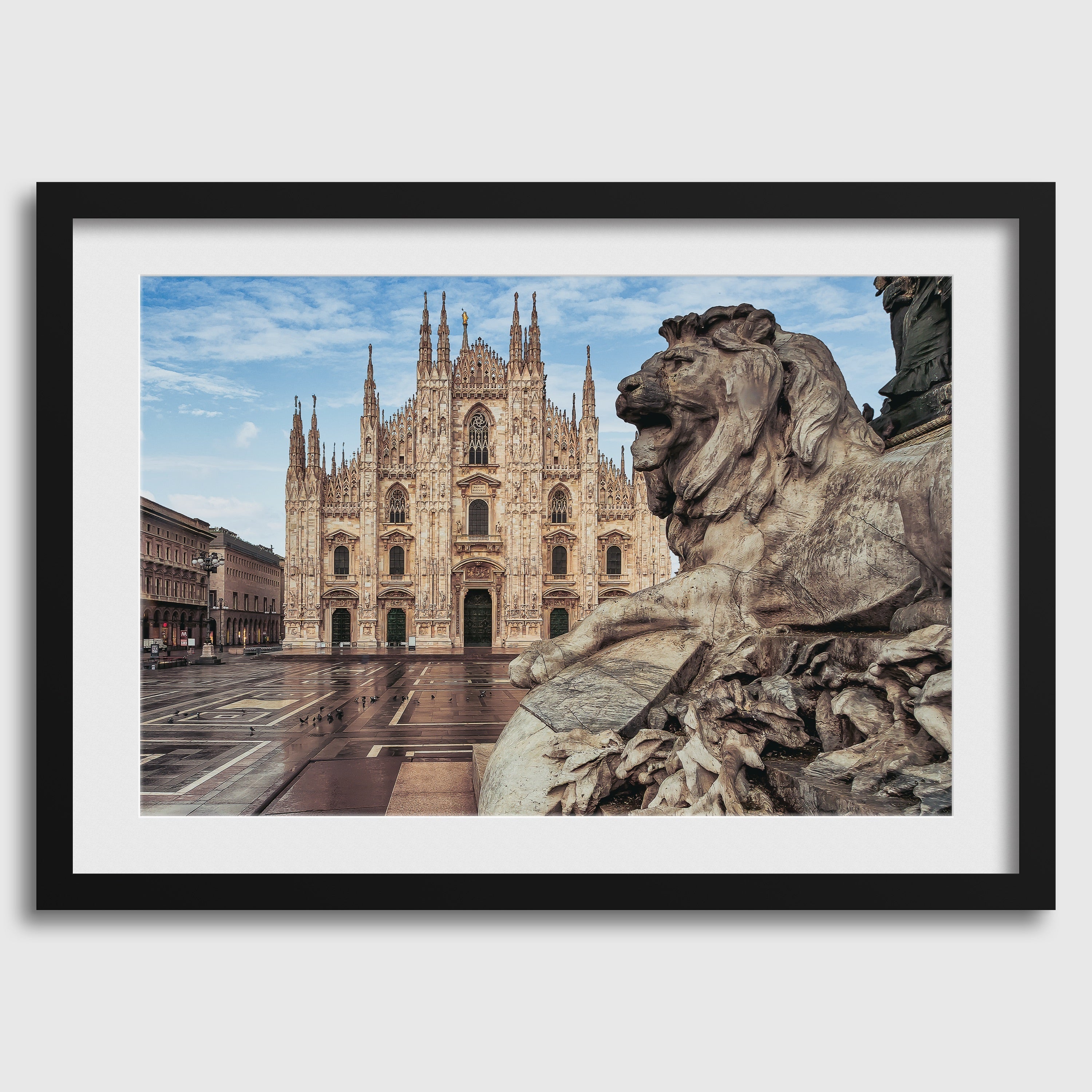
Browse our Photography collection, Pablo Meilán Campagnale’s Italy photographs, and Andrew Shoukry’s architectural work for examples where paper surface should support tone, light, and structure.
Does Smooth Matte Mean Lower Quality?
No.
This is a common mistake.
Some buyers assume textured paper is always premium and smooth paper is always ordinary. That is not true.
There are premium smooth matte fine art papers. There are also inexpensive smooth matte papers. The surface alone does not define the quality level.
A smooth 100% cotton rag paper can be a serious fine art paper. A cheap smooth poster stock can be basic décor paper. The phrase “smooth matte” tells you the feel of the surface, not the whole material standard.
That is why the seller should name the paper or at least give meaningful details: weight, composition, finish, coating, and print process.
For example, Canson’s Rag Photographique is a smooth matte fine art and photo paper made from 100% cotton, available in 210 or 310 gsm. Hahnemühle Photo Rag is also a premium fine art paper used for photography and art reproductions.
So smooth paper can absolutely be premium.
It just serves a different visual purpose.
Does Textured Mean Better?
No.
Textured paper can be excellent, but it is not automatically better for every image.
Texture is useful when it supports the artwork. It is less useful when it competes with the artwork.
A textured paper can add richness to a painterly reproduction. But on a very clean poster, it may make the surface feel busy. On a typographic print, it may slightly soften the crispness of the letters. On a geometric print, it may distract from the precision of the composition.
The best paper choice is not the most expensive-sounding option.
The best paper choice is the one that makes the artwork look most convincing.
How to Decide Before You Buy
Before choosing between textured fine art paper and smooth matte paper, ask these questions:
- Is the artwork painterly or graphic?
- Does the image depend on texture, atmosphere, and tonal depth?
- Or does it depend on sharp edges, typography, and flat colour?
- Would visible paper texture make the print feel richer?
- Or would visible paper texture distract from the design?
- Will the print be framed behind glazing?
- Will the print be handled unframed?
- Is the paper named clearly, or described only with vague terms?
Those questions are more useful than asking whether textured or smooth paper is “better” in general.
How This Relates to Giclée Printing
For giclée printing, paper choice matters because the paper is part of the printing system.
A good giclée print is not only about the printer. It also depends on ink, colour management, source image quality, and a paper surface designed to receive fine art inkjet printing well.
That is why the paper’s coating matters.
A heavy textured paper without the right coating may not produce the best result. A smooth fine art paper with the right coating may reproduce detail and tone beautifully. A textured fine art paper with the right coating may give painterly images more depth and presence.
So the real question is not just texture versus smoothness.
It is:
Is this paper designed for this kind of print?
For more on the print process, read Giclée vs Digital Print: What’s the Real Difference?.
Where 9 Art Prints Fits
At 9 Art Prints, we think paper should suit the artwork.
Many of our core fine art reproductions are produced on Hahnemühle German Etching 310 gsm because its weight, texture, and matte fine art surface work especially well for painterly, historical, atmospheric, and richly detailed images.
That kind of paper makes sense for works where the physical surface of the print should feel substantial.
For graphic works, posters, Bauhaus designs, Josef Albers-inspired colour studies, maps, and typographic pieces, the paper question is slightly different. Those works often need clarity, structure, and clean colour more than obvious texture.
That is why the best answer is not one universal paper for every image.
The best answer is paper matched to the artwork.
You can browse relevant collections here:
- Orientalist Art for painterly and detailed historical works.
- Vintage Maps and Posters for graphic travel, film, advertising, and map prints.
- Bauhaus and Avant-Garde Modernism for geometric and typographic modernist works.
- Josef Albers-inspired prints for clean nested-square colour studies.
- Photography for photographic prints where surface choice depends on tone, contrast, and composition.
The Bottom Line
Textured fine art paper is not automatically better than smooth matte paper.
Smooth matte paper is not automatically less premium than textured paper.
They do different jobs.
Choose textured fine art paper when the artwork benefits from surface, depth, softness, and physical presence. Choose smooth matte paper when the artwork needs clean edges, flat colour, typography, geometry, or a quieter surface.
The right paper should disappear just enough to let the artwork work.
And when it needs to be noticed, it should be noticed for the right reason.
Further Reading
- The Ultimate Guide to Fine Art Prints
- What Paper Is Best for Art Prints?
- Does Thicker Paper Make for a Better Art Print?
- Giclée vs Digital Print: What’s the Real Difference?
- Fine Art Prints vs Posters: Why the Paper Changes Everything
- How Do I Know If an Art Print Is Actually High Quality?
- What Does Archival Mean in Art Prints?