Best Bauhaus Prints for Minimalist Interiors
This article is part of our Ultimate Fine Art Print Buyer's Guide.

A minimalist room is hard to hang art in. The walls are pale, the furniture is plain, and almost any picture either disappears or takes over. Bauhaus art is one of the few kinds that was designed for exactly this setting. The school that invented much of what we now call modern design also made the pictures to go with it.
In brief: The best Bauhaus prints for a minimalist room are the ones with one clear idea — a design built from a few blocks, a single colour study, a few shapes in space. Choose one strong piece rather than many small ones and keep the frame simple. Below are ten prints that do that, from the 1923 exhibition to the painters to the neighbours the school admired.
The Bauhaus, briefly
The Bauhaus was a German school of art and design, founded by the architect Walter Gropius in Weimar in 1919. It moved to Dessau in 1925 and to Berlin in 1932, and closed in 1933 under pressure from the Nazi government. In fourteen years it brought painters, architects, typographers, weavers and furniture makers into one building and asked them to work together. Its teachers included Paul Klee, Wassily Kandinsky, László Moholy-Nagy and Josef Albers.
The school's idea was that art and everyday design should follow the same rules: clear structure, honest materials, nothing added for decoration's sake. That is also a fair description of a good minimalist room, which is why the two fit so naturally.
Ten Bauhaus prints for minimalist rooms
The 1923 exhibition
In 1923 the Bauhaus held its first big public exhibition in Weimar, and the school's designers made posters and postcards to announce it. Three of those images make the best starting point for a Bauhaus wall.
1. Bauhaus — Ausstellung 1923. A face in profile built from nothing but black rectangles, with the exhibition's name and dates set beneath it. Black on warm cream, it is the most minimal image the exhibition produced and the easiest to place: above a desk, a console or a bench in an entrance hall.

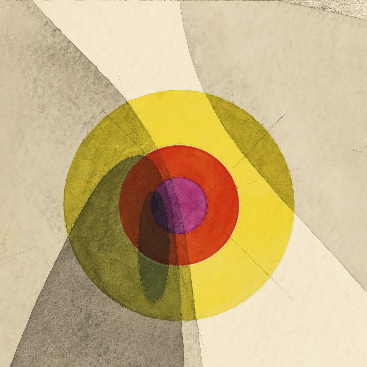
2. Joost Schmidt — Bauhaus Exhibition Poster. Joost Schmidt, then a student and later head of the school's printing and advertising workshop, designed a poster for the exhibition. This square print takes its central composition: rings of yellow, red and violet over pale overlapping planes. It is the colour to the first print's black and white, and the two hang well together in matching frames.

3. Paul Klee — Bauhaus Exhibition Weimar 1923, Postcard. Several of the school's masters designed postcards for the exhibition. Klee's is a tall tower of red, yellow and white shapes on a bright blue ground, hand-drawn and playful — the right choice if you want the Bauhaus story without the hard edges.
The painters
4. Paul Klee — Polyphonic Architecture. Klee taught at the Bauhaus for ten years, and his colour grids are the classroom ideas made into pictures: layered squares where each colour changes the one beside it. Warmer than anything else on this list, it suits a minimalist room that uses natural wood and linen. Our Paul Klee guide covers the rest of his work.

5. Wassily Kandinsky — Small Worlds II. Kandinsky joined the Bauhaus in 1922 and made the Small Worlds portfolio the same year. Sharp lines, points and bursts of colour cluster in the middle of a white sheet, so the print has energy without clutter. It suits a white wall that needs some movement.
6. László Moholy-Nagy — Kestnermappe (Komposition). Moholy-Nagy taught at the Bauhaus from 1923 and pushed it toward photography, light and machines. This composition — tall black planes and fine crossing lines on a plain ground — is about as close as painting gets to architecture. Ideal in a home office or a room with a lot of glass and steel.
7. After Josef Albers — Statement Duo, Temple & Oasis. Albers studied and taught at the Bauhaus, then spent the rest of his career in America, where he began his famous series of nested squares, Homage to the Square. These prints are inspired by that series. They are the purest colour you can put on a minimalist wall, and a pair side by side is one of the most reliable arrangements we sell. The ideas behind them are explained in Homage to the Square.
The neighbours
The Bauhaus published a series of books by the artists it most admired. Three of them belong on this list.

8. Piet Mondrian — Composition with Large Red Plane, Yellow, Black, Grey and Blue. The Dutch painter's book on his ideas was published in the Bauhaus series in 1925. His black grids and blocks of primary colour are the most architectural pictures of the century. One Mondrian can hold a whole white wall.
9. Theo van Doesburg — Counter-Composition VI. Van Doesburg, Mondrian's partner in the De Stijl movement, moved to Weimar in the early 1920s and ran an independent course for Bauhaus students. His counter-compositions turn the grid on the diagonal — here, heavy black bars crossing a fine tilted grid — which gives a still room some tension.
10. Kazimir Malevich — White on White. The Bauhaus published Malevich's book in 1927. White on White is the most minimal picture on this list — a pale square tilted on a warm white ground — and for a truly minimal room it is the boldest choice you can make.
How to hang Bauhaus in a minimalist room
One strong piece beats several small ones. A minimalist room is about restraint. A single large print, well placed, does more than a gallery wall. If you want more than one, use a pair in identical frames — the two 1923 exhibition prints, or two Albers colour studies.
Keep the frame simple. Black for the exhibition prints, Moholy-Nagy and Mondrian; natural oak or white for Klee, Albers and Malevich. Avoid ornate frames — they fight the whole idea. If you are framing an unframed print yourself, a wide mount (a card border inside the frame) suits Bauhaus proportions well; Should I Get My Art Print Mounted? explains how.
Leave the wall around it empty. Bauhaus design is built on proportion and empty space. Centre the print on its wall or above its piece of furniture, and resist the urge to add objects around it.
Size for the furniture. Art above a sofa, bed or sideboard should span roughly 60 to 75 per cent of its width. Posters can go larger than you think; the originals were made to be seen from across a street. The Fine Art Print Size Guide has the details, and What Paper Is Best for Art Prints? explains why graphic images and paintings suit different surfaces.
Where to browse
Bauhaus & Geometric Modernism holds the full range. For individual artists: Paul Klee · László Moholy-Nagy · Josef Albers Inspired Prints · Joost Schmidt · Theo van Doesburg · Kazimir Malevich.
Summary: For a minimalist room, choose Bauhaus art with one clear idea. Start with the 1923 exhibition prints if you want the icon, Albers or Klee if you want colour, Mondrian or Malevich if you want to go further. Hang one strong piece or a matched pair, in a simple frame, with space around it.